 As VCU’s men’s and women’s basketball teams march into the postseason, the school’s athletic department is investing in a new look.
Virginia Commonwealth University announced a slate of new logos Wednesday, including a fresh primary emblem to replace the black-and-gold, italicized “VCU” that graces center court at the Siegel Center, as well as the front of the school’s basketball jerseys.
Ed McLaughlin said adding a new logo was a priority since he took over as the school’s athletic director in the summer of 2012, when he noticed there were several scattered VCU images but none seemed to stand out above the rest.
“I really felt like we needed a common brand and a common logo,” McLaughlin said.
McLaughlin did not provide a precise dollar figure for the total cost of the new logo project, but said expenses could climb into the millions of dollars with design fees and costs associated with replacing uniforms, signs and other fixtures to bear the new VCU logos.
Ohio-based Rickabaugh Graphics, which previously designed logos for Ohio State University, Marquette University and the Philadelphia 76ers, was in charge of drafting the new VCU emblems.
The athletic department settled on Rickabaugh after sending out a request for proposals last March. The final slate of emblems were chosen in September.
By that time, however, it was too late to roll out the new logos in time for the 2013-14 academic year. Instead, the athletic department decided to hold the designs until the month that the men’s basketball team first captured the national spotlight with a Final Four appearance three years ago, said Robby Robinson, VCU’s associate athletic director of external affairs.
“We should find the time that VCU is in the brightest limelight nationally,” he said at the Wednesday press conference. “And for us, that is in the month of March.”

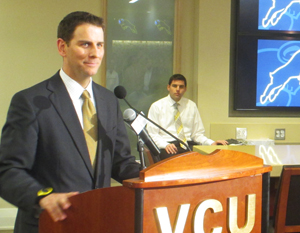
VCU’s Associate Athletic Director for External Affairs Robby Robinson announcing the new logo schemes.
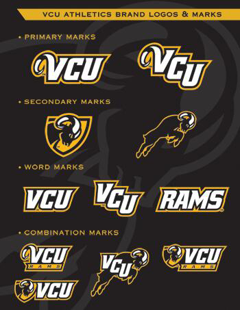
The “horned VCU,” as it’s called, is the school’s new primary logo. It’s most similar to the italicized, black-and-gold VCU on the Siegel Center floor and will be the mark the school sends to the NCAA and CBS as its official logo for March Madness and the forthcoming Division I national basketball championships.
The school also has a pair of new secondary logos – one that depicts a black and gold, leaping Ram, and another with the head of the Ram superimposed on a gold shield. The package also includes a set of word marks in the VCU color scheme and a specialty font.
Robinson said merchandising was a driving force behind secondary logos and the word marks, which will allow merchandising companies to design shirts with separate VCU images across the front, down the sleeves and near the neckline of a T-shirt or sweatshirt.
The athletic department also rolled out a line of logos, including one or more of its new emblems underlined by a row of customizable text. Robinson said these customizable marks will allow VCU to sell merchandise specific to any sport.
Apparel bearing the new emblems is available now at the VCU bookstore’s website. The school will discontinue and begin phasing out the older logo designs, although several items with the old emblems are still available in stores and online.
VCU plans to have its athletic teams outfitted with the new emblems by the next academic year, but its basketball teams will stick with its current outfits for the remainder of this season.
“It’s going to take us a little while to get everything changed out,” McLaughlin said.
 As VCU’s men’s and women’s basketball teams march into the postseason, the school’s athletic department is investing in a new look.
Virginia Commonwealth University announced a slate of new logos Wednesday, including a fresh primary emblem to replace the black-and-gold, italicized “VCU” that graces center court at the Siegel Center, as well as the front of the school’s basketball jerseys.
Ed McLaughlin said adding a new logo was a priority since he took over as the school’s athletic director in the summer of 2012, when he noticed there were several scattered VCU images but none seemed to stand out above the rest.
“I really felt like we needed a common brand and a common logo,” McLaughlin said.
McLaughlin did not provide a precise dollar figure for the total cost of the new logo project, but said expenses could climb into the millions of dollars with design fees and costs associated with replacing uniforms, signs and other fixtures to bear the new VCU logos.
Ohio-based Rickabaugh Graphics, which previously designed logos for Ohio State University, Marquette University and the Philadelphia 76ers, was in charge of drafting the new VCU emblems.
The athletic department settled on Rickabaugh after sending out a request for proposals last March. The final slate of emblems were chosen in September.
By that time, however, it was too late to roll out the new logos in time for the 2013-14 academic year. Instead, the athletic department decided to hold the designs until the month that the men’s basketball team first captured the national spotlight with a Final Four appearance three years ago, said Robby Robinson, VCU’s associate athletic director of external affairs.
“We should find the time that VCU is in the brightest limelight nationally,” he said at the Wednesday press conference. “And for us, that is in the month of March.”

VCU’s Associate Athletic Director for External Affairs Robby Robinson announcing the new logo schemes.
The “horned VCU,” as it’s called, is the school’s new primary logo. It’s most similar to the italicized, black-and-gold VCU on the Siegel Center floor and will be the mark the school sends to the NCAA and CBS as its official logo for March Madness and the forthcoming Division I national basketball championships.
The school also has a pair of new secondary logos – one that depicts a black and gold, leaping Ram, and another with the head of the Ram superimposed on a gold shield. The package also includes a set of word marks in the VCU color scheme and a specialty font.
Robinson said merchandising was a driving force behind secondary logos and the word marks, which will allow merchandising companies to design shirts with separate VCU images across the front, down the sleeves and near the neckline of a T-shirt or sweatshirt.
The athletic department also rolled out a line of logos, including one or more of its new emblems underlined by a row of customizable text. Robinson said these customizable marks will allow VCU to sell merchandise specific to any sport.
Apparel bearing the new emblems is available now at the VCU bookstore’s website. The school will discontinue and begin phasing out the older logo designs, although several items with the old emblems are still available in stores and online.
VCU plans to have its athletic teams outfitted with the new emblems by the next academic year, but its basketball teams will stick with its current outfits for the remainder of this season.
“It’s going to take us a little while to get everything changed out,” McLaughlin said.