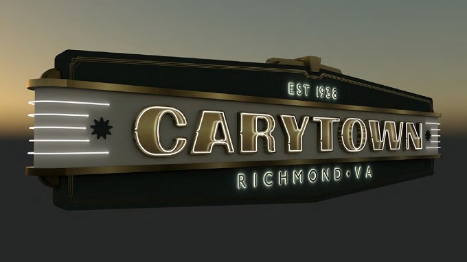
The Art Deco-style sign would be lighted with a combination of neon tubing and LED lights. (City documents)
A decade-plus effort to provide new signage for the entrance to Carytown has reached the finish line.
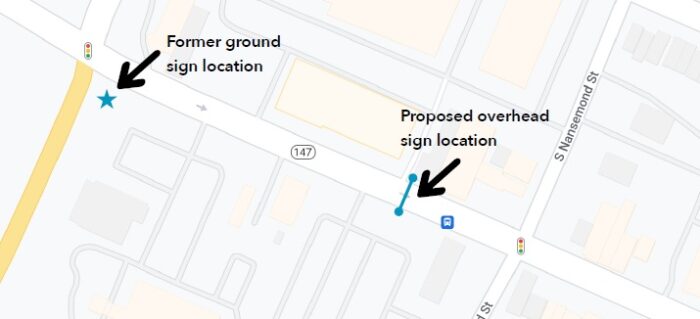
City approval is expected this week for a new gateway sign in the 3500 block of Cary Street that would mark the start of the nine-block shopping district for drivers and pedestrians traveling east on the one-way road.
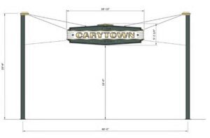
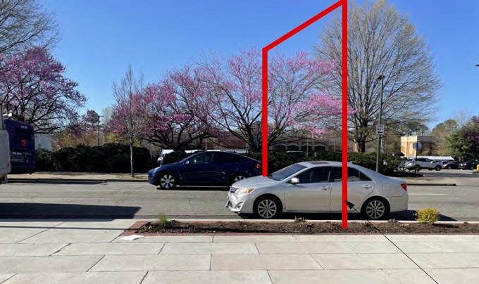
The two-sided, Art Deco-style sign with neon tubing and LED lights would be suspended above the road via steel wires attached to two 25-foot steel poles, creating an arch-like entrance that cars would pass under just before Cary’s intersection with Nansemond Street. The green- and white-colored sign with gold accents reads “Carytown” with “Richmond VA” below it and “Est 1938” above.
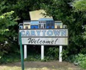
In the works since 2011, the sign will replace a decades-old wooden sign that had stood beside Cary across from Thompson Street. That sign, which had replaced an older one from the 1990s, fell down last year, providing further motivation for a replacement.
The Carytown Merchants Association has driven the sign effort, which board member and city liaison Kelley Banks said was hampered over the years by challenges with location, design and funding.
Working with city officials, CMA secured the funding via American Rescue Plan funds that the city had received to help businesses affected by the Covid-19 pandemic. The federal funds are covering the roughly $100,000 cost for the sign, Banks said.
“That was a key to the city being able to fund the sign and get us over the finish line,” said Banks, co-owner of Merrymaker Fine Paper.
“What has resulted is a product of persistence and volunteer effort, and really good collaboration with the city, on finally realizing the sign in a very permanent and what I think is going to be something that really has impact, not just for Carytown but for Richmond, and an identity of one of the most important parts of Richmond.”
Banks, who joined the CMA board two years ago specifically to assist the sign effort, said the original plan was for another ground sign to replace the older one, based on the thinking that a gateway sign would be too expensive.
The group hired design firm Campfire & Co. to create a branding package, but the ground sign plan hit a roadblock when the preferred location was found to be within right-of-way controlled by the Virginia Department of Transportation, which Banks said doesn’t allow permanent signage on its property.
 Further prolonging the effort was the need for consensus among CMA’s members on the design and the cost, which was found to be lower with the wire suspension approach than with a full arch or more structural sign.
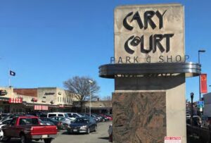
Local manufacturer Wellcraft MFG designed the gateway sign, taking design cues from the Art Deco signage of the 1930s-era Carytown Court Shopping Center and the 1928 Byrd Theater. CMA is contracting with Wellcraft for annual refurbishment and repair as needed, and Glen Allen-based Messer Contracting is signed on to build the sign and the concrete footings needed for the poles.
The sign’s location is aligned with a gap between buildings at Carytown Exchange. It would cross Cary between the Torchy’s Tacos storefront and the Kroger parking lot.
The structure is designed to sustain high winds, according to a city planning report, which recommends approval and notes support for the sign from the owner of the Kroger-anchored International Shopping Center and the property manager of Carytown Exchange.
The Richmond Planning Commission is slated to approve a final review by the city’s Urban Design Committee at its meeting this Tuesday as part of its consent agenda, in which business considered to be routine is voted on as a block.
If approved as expected, Banks said CMA is aiming to have the sign installed in time for this year’s Carytown Watermelon Festival in August.
While the path to this point has been winding and arduous for the CMA’s 75 or so members, Banks said they are pleased with the final result of a gateway entrance to Carytown’s roughly 200 businesses. She credited city staff and Councilmember Stephanie Lynch for helping to get the concept across the finish line.
“It was kind of serendipitous for (the ground sign) to be rejected, because it, I think, got us something better, and something that I hope could trickle to other special parts of Richmond like Scott’s Addition, Jackson Ward, Shockoe Bottom, the Fan,” Banks said.
“The merchants association was the driving force behind this, and that’s small business owners in Richmond and volunteer time,” she said. “We spent a lot of time talking about this amongst our members, showing it to other businesses in Carytown, getting input, getting feedback. I think to most people it’s going to seem like a surprise, but for a lot of people, we’ve been working on it for a long time.”

The Art Deco-style sign would be lighted with a combination of neon tubing and LED lights. (City documents)
A decade-plus effort to provide new signage for the entrance to Carytown has reached the finish line.
City approval is expected this week for a new gateway sign in the 3500 block of Cary Street that would mark the start of the nine-block shopping district for drivers and pedestrians traveling east on the one-way road.
The two-sided, Art Deco-style sign with neon tubing and LED lights would be suspended above the road via steel wires attached to two 25-foot steel poles, creating an arch-like entrance that cars would pass under just before Cary’s intersection with Nansemond Street. The green- and white-colored sign with gold accents reads “Carytown” with “Richmond VA” below it and “Est 1938” above.
In the works since 2011, the sign will replace a decades-old wooden sign that had stood beside Cary across from Thompson Street. That sign, which had replaced an older one from the 1990s, fell down last year, providing further motivation for a replacement.
The Carytown Merchants Association has driven the sign effort, which board member and city liaison Kelley Banks said was hampered over the years by challenges with location, design and funding.
Working with city officials, CMA secured the funding via American Rescue Plan funds that the city had received to help businesses affected by the Covid-19 pandemic. The federal funds are covering the roughly $100,000 cost for the sign, Banks said.
“That was a key to the city being able to fund the sign and get us over the finish line,” said Banks, co-owner of Merrymaker Fine Paper.
“What has resulted is a product of persistence and volunteer effort, and really good collaboration with the city, on finally realizing the sign in a very permanent and what I think is going to be something that really has impact, not just for Carytown but for Richmond, and an identity of one of the most important parts of Richmond.”
Banks, who joined the CMA board two years ago specifically to assist the sign effort, said the original plan was for another ground sign to replace the older one, based on the thinking that a gateway sign would be too expensive.
The group hired design firm Campfire & Co. to create a branding package, but the ground sign plan hit a roadblock when the preferred location was found to be within right-of-way controlled by the Virginia Department of Transportation, which Banks said doesn’t allow permanent signage on its property.
 Further prolonging the effort was the need for consensus among CMA’s members on the design and the cost, which was found to be lower with the wire suspension approach than with a full arch or more structural sign.
Local manufacturer Wellcraft MFG designed the gateway sign, taking design cues from the Art Deco signage of the 1930s-era Carytown Court Shopping Center and the 1928 Byrd Theater. CMA is contracting with Wellcraft for annual refurbishment and repair as needed, and Glen Allen-based Messer Contracting is signed on to build the sign and the concrete footings needed for the poles.
The sign’s location is aligned with a gap between buildings at Carytown Exchange. It would cross Cary between the Torchy’s Tacos storefront and the Kroger parking lot.
The structure is designed to sustain high winds, according to a city planning report, which recommends approval and notes support for the sign from the owner of the Kroger-anchored International Shopping Center and the property manager of Carytown Exchange.
The Richmond Planning Commission is slated to approve a final review by the city’s Urban Design Committee at its meeting this Tuesday as part of its consent agenda, in which business considered to be routine is voted on as a block.
If approved as expected, Banks said CMA is aiming to have the sign installed in time for this year’s Carytown Watermelon Festival in August.
While the path to this point has been winding and arduous for the CMA’s 75 or so members, Banks said they are pleased with the final result of a gateway entrance to Carytown’s roughly 200 businesses. She credited city staff and Councilmember Stephanie Lynch for helping to get the concept across the finish line.
“It was kind of serendipitous for (the ground sign) to be rejected, because it, I think, got us something better, and something that I hope could trickle to other special parts of Richmond like Scott’s Addition, Jackson Ward, Shockoe Bottom, the Fan,” Banks said.
“The merchants association was the driving force behind this, and that’s small business owners in Richmond and volunteer time,” she said. “We spent a lot of time talking about this amongst our members, showing it to other businesses in Carytown, getting input, getting feedback. I think to most people it’s going to seem like a surprise, but for a lot of people, we’ve been working on it for a long time.”




Excellent idea. You can find these all over out west. A nice added touch.
It looks like a nice sign, kudos to those who got it done
This sign looks great and its design suits Carytown. Nice job, CMA!
Finally, shoppers will be able to find it!
I opposed this expenditure at the City level for years and now I see that federal tax dollars paid $100k for it. So, should we use tax dollars to put up signs in every sector of the city, the state . . . The nation?!! A trillion here, a trillion there, so what, huh? No one has any problem finding Carytown. They didn’t need a sign. but If they wanted a sign so badly, why didn’t the merchants and property owners pay for it themselves? Why did they go to the feds (and therefore, you and me)? Somewhere, at some… Read more »
Investing in the upkeep and curb appeal is a small cost compared to the millions of tax revenue dollars that Carytown Merchants generates for the city, state, and federal governments.
You are making it sound like an either/or proposition, as Bruce says, Carytown is clearly doing fine — that doesn’t mean that the sign should’ve been made for a struggling retail neighborhood.
At least this isn’t as stupid as Hissonner’s totally unthought out Pedestrian Mall idea….. it would be just like City Halls like Richmonds’ to screw something up that is already working, like they did in Shockoe Bottom to give sweetheart deals to their chosen slow contractors.
… And get off my lawn!
If you were Bruce’s neighbor, he’d likely move. So, don’t worry about your weeds. Did you know green yards are horrible for the environment? Perhaps you should use some of the rocks from your XXXX for your yard. Haha
Psst! Bruce is a friend of mine.
Wow! Look at you! I DO like the sign, but, yeah, you are singing a song I have sung since the early 1990s when Albany, NY paid 600k in 1990s $ for a bus kiosk (a very nice one that looked “Victorian”) and claimed it cost the taxpayers “nothing” because it was Federal funds. When some people started pointing out what you are (I was actually one of them, in my case interviewed on local TV in a sort of faux- Man on the Street situation) the city then said “Well…. these were USE IT OR LOSE IT transportation funds…”… Read more »
Placemaking, especially for a pretty unique collection of small businesses within Richmond’s most vibrant commercial corridor, seems to be a valid use of American Rescue Plan money.
It certainly is a lot better use of taxpayer money than the prior administration’s PPP Loans Program that was chock full of waste, fraud, and abuse.
Richmond, at the very least, receives a tangible, physical benefit, from the deployment of these funds.
And no, not every out-of-towner visiting the Richmond area knows where Carytown is.
Wow. $100K. I am with Bruce. Such wasteful spending. I am a fan of Carytown and making the area look nice, but the merchants should have paid. Heck, maybe the firm that developed the Publix’s anchored shopping center could have ponied up via a proffer? Lord knows the city asks hefty proffers of developers looking to build housing units (and people wonder why housing is “unaffordable”). I left the City 20 years ago and am glad I did. Soon, my family will leave Henrico. Well anyways. It will look pretty…until some anarchist or ignorant (maybe stupid) kid (Oh, maybe that… Read more »
There are no cash proffers in the City of Richmond. Never have been any in the 30 years I’ve been here. Henrico either.
Bruce, I respectfully disagree. I’m generally not a fan of government largess, but these sort of “placemaking” projects have real value. They help define neighborhoods and cities and appear in tourism brochures and Instagram feeds, which in turn drive more tourists and visitors. The value is not wayfinding; it’s brand building.
Retailers leave the regional malls to get a store in Carytown. It already has a brand. Nobody has any problem finding it.
Now make it “Pedestrian and public transportation ” ONLY! On weekends
Oh, Brilliant….
Love this! Good looking design
I love it and I get the CMA worked to get funds via the City to fund its construction but SO glad they will have a regular maintenance agreement managed and paid for by the CMA. God help us if the City was responsible for maintenance; part of the sign went out it would take the city 12-18 months to change a bulb. I strongly suggest they put some good bollards in concrete around it.
Yes it’s a nice sign, likely because City Hall had nothing to do with making it and yes, the city would likely treat the sign like it treats the school buildings — something to not fund the maintenance for so they can shame the State eventually into giving it more unearned funds to distribute corruptly and still not maintain the schools.
The 1930’s art deco design is perfect! Put it up soon. Now, we need a matching one on the opposite end and make it a pedestrian plaza like Lincoln Road in South Beach.
Because this will FINALLY get foot traffic in Carytown???
Too many people think with ideology.
Very cool sign. Congrats to the forces behind this!
Bill: If you really want to cause the demise of Carytown eliminating cars on weekends will do it! It’s been tried in many other towns/small cities only to be reversed at a later date.
Yes, I think these people have even heard about this and choose to put their fingers in their ears in a “It may not tend to work in PRACTICE, but BOY does it ever work in THEORY!!!” sort of university professor kind of way.
Oh yes, bc the festivals where Cary is closed to car traffic are all an abysmal failure. Nobody comes…
Let’s be serious, Carytown would have no issue attracting tourists and visitors by making it marginally more difficult to arrive by car. It would make the area safer and more enjoyable to exist in though.
This is a tired argument, with a bit of creativity, the street would continue to survive and thrive without automobile traffic.
Also a bit of money and inconvenience — you’d have to build a massive parking garage like Charlottesville did.
Trust me, I LIKE these things, but only when they work. I like the Charlottesville one.
The main concern that the people who actually live there is where will all the cars GO? They worry that they will go to the surrounding residential streets and one of the worries of the business owners is that the increase in difficulty in parking (without a big parking garage) will mean less traffic, foot or otherwise.
So whatever happened to the sign re-design from several years ago as seen here?
https://www.styleweekly.com/the-old-carytown-sign-is-on-its-way-out/
When did a sign become “signage?”
When it started being a magnet for subsidies. There is all sorts of corruptly expensive interpretive signage all over the USA these days, usually with some old grievance real or exaggerated spelled out on them.
Why not just call them signs?
Sounds like something the legendary George Carlin would’ve said.
Thanks a bunch Stoney!
I love the design – very stylish. I can’t wait to see it – particularly at night with the neon lit up. Gotta say, I’m very impressed.
This design takes me back in time (days-gone-by) to the beginning of these few blocks becoming a future shopping mecca in Richmond. Love it!