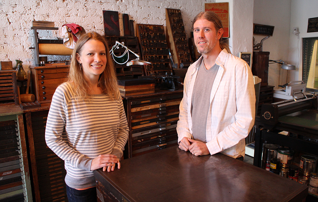
Heather and Nathan Simon in their Jackson Ward studio, which could be mistaken for a museum. (Jonathan Spiers)
When it comes to getting creative, Heather and Nathan Simon – the couple behind Jackson Ward print design firm BigTree – don’t have to look far for inspiration.
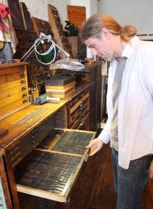
Their narrow, 800-square-foot studio on Brook Road just off West Broad Street is a working museum of sorts, filled with 20 antique printing presses and an assortment of wood and metal font types that date back to the mid-1800s.
It’s also a few blocks from their Jackson Ward home, where Heather says she comes up with most of her ideas and designs in the quiet of the late evening, when she’s not finding inspiration in the outdoors.
Nathan looks to their collection, which they’ve amassed since starting their shop in 2008, as well as to the history behind each machine. With their various print types – nearly 300 fonts in all – the VCU grad said, “Anything from the past definitely speaks to the future.”
With clients such as Goochland-based Courthouse Creek Cider and Midlothian repair shop Garrett’s Automotive, the Simons blend 19th-century printing techniques with 21st-century technologies and aesthetics to create logos and designs for print products as well as websites.
They’re in the midst of one of their biggest projects to date: a rebrand of Richmond Waldorf School, where their daughter is a student. They recently unveiled a new logo for the school, and work also will include photography, copywriting, advertisements and signage, custom templates for letterhead, and website design and development.
Richmond BizSense sat down with the Simons to learn more about their approach to design, their blend of old and new and how they pick out a font out of hundreds to choose from. The following is an edited transcript:
Richmond BizSense: Your shop is unique for mixing old print techniques with modern design technology. What drew you to want to work with old printing presses?
Nathan Simon: There’s something different pushing print for a digital printer than to actually create this almost work of art on these tabletop printing presses. There’s so much more enjoyment that we get from printing this way than the other.
Heather Simon: It gives a deeper appreciation of just what design is. It helps with the planning about it, because on a computer, you’re looking up Illustrator and you want to throw something on there, you just go: ‘Alright, well, here’s the title, here’s this and here’s this,’ and if you don’t like it, you just drag stuff and rearrange it. Sometimes there doesn’t seem to be as much pre-thought on, ‘Well, how are you going to direct the eye? Should it start here or here?’
If you’re going to do this, you really have to plan that ahead of time, because if you decide that’s not the way, then you have to take it all apart and spend another four hours re-placing where it should go. So a lot more thought goes into the composition of it.
RBS: How does working with printing presses affect your designs?
NS: Every morning when we walk in the door, there’s so much inspiration surrounding us. When you look at the cast-iron printing presses, to think about what was printed on them such a long time ago…
HS: …even just how they’re built and how everything was created. It was created with more intention, it was created with quality. And you had to take your time with it, because when you print, it’s one by one, and when you assemble it, it’s letter by letter. So you really get to take your time in the design and make it right. I feel like that carries onto the inspiration when we create anything.
RBS: Do you have a favorite font?
NS: We have a couple here, but they’re not even digitized, so I don’t even know if they actually technically have names to them.
RBS: Where does the name ‘BigTree’ come from?
HS: My love of nature. The way things start from a seed and can grow into something strong – kind of like a startup business.
RBS: Describe your process with a client, how you start your creative process.
NS: We basically just immerse ourselves in their business. Then after that, once we’ve decided what exactly we’re going to do for them, some of our inspiration will come from looking through our cases here. Even looking through old Harper’s Bazaar magazines.
HS: I usually come up with my ideas when I’m not here. There are a lot of times where I’ll say goodnight and I go upstairs and sit on the bed for two hours with my notebook. I’d say that’s where a lot of logos have come from, that’s where a lot of ideas have come from – just sitting by myself in quiet at nighttime once the day’s over for everybody else.
RBS: How does a project or client point you in the direction of one particular font or design?
NS: Every font contains a different emotion, a different feeling.
HS: You’re just drawn to it. You just open and look at them and have in mind what you’re trying to convey and feel, because every brand has a feeling. So when you open up and look at the type, we can feel the message that the type is saying. I don’t know if that makes sense. They speak to us.
RBS: Have you had a favorite campaign, one that serves as a calling card?
HS: We did a direct mailer and greeting cards for the Hole in the Wall camps for children with terminal illnesses. It kind of got at your heart a little bit and felt good to work on that. We’ve done work for Art 180 that stands out. We did an invitation for a fundraiser for them – on the front we did a letterpress piece that was done by hand, and the inside was digital.
RBS: If you could ask anyone you admire one question, who would that person be and what question would you ask?
NS: It would probably be Frederick Goudy. He was a type designer, created over 90 different typefaces. The man was amazing. He died well before I was born, but I’d love to know what inspired him.
In our acquisition of all the old antique printing equipment, the stories that I’ve gotten from the people that have used them in the past have meant so much to me. One of the presses that we have survived a kamikaze attack – it was on the USS Essex during World War II, survived the kamikaze attack, and ended up in our possession. In speaking with this World War II veteran, who I consider the most interesting man in the world – just hearing his stories and knowing that he’s printed on it and I’m using something that’s a piece of history, it’s just phenomenal that we have the opportunity to use these in our business. And that’s just one example.


Nathan and Heather do great work. Congrats to you guys!
I have always been fascinated by fonts and old printing presses. I enjoyed learning about their business and collection.