For some American urbanites, skylines are a point of pride. And the number of building cranes silhouetting a downtown’s skies is an unofficial measure of economic health.
While Richmond can’t boast particularly tall buildings, it does have a solid, distinctively layered and cascading downtown skyline when viewed from south of the James River.
The stalwart sandstone and terracotta structures of East Franklin and East Main streets, situated farther uphill, give way to bunker-like parking garages and the James Center. These form the backdrop for a few elegant, stand-alone towers — the Federal Reserve Bank, Dominion Energy tower and Gateway Plaza.
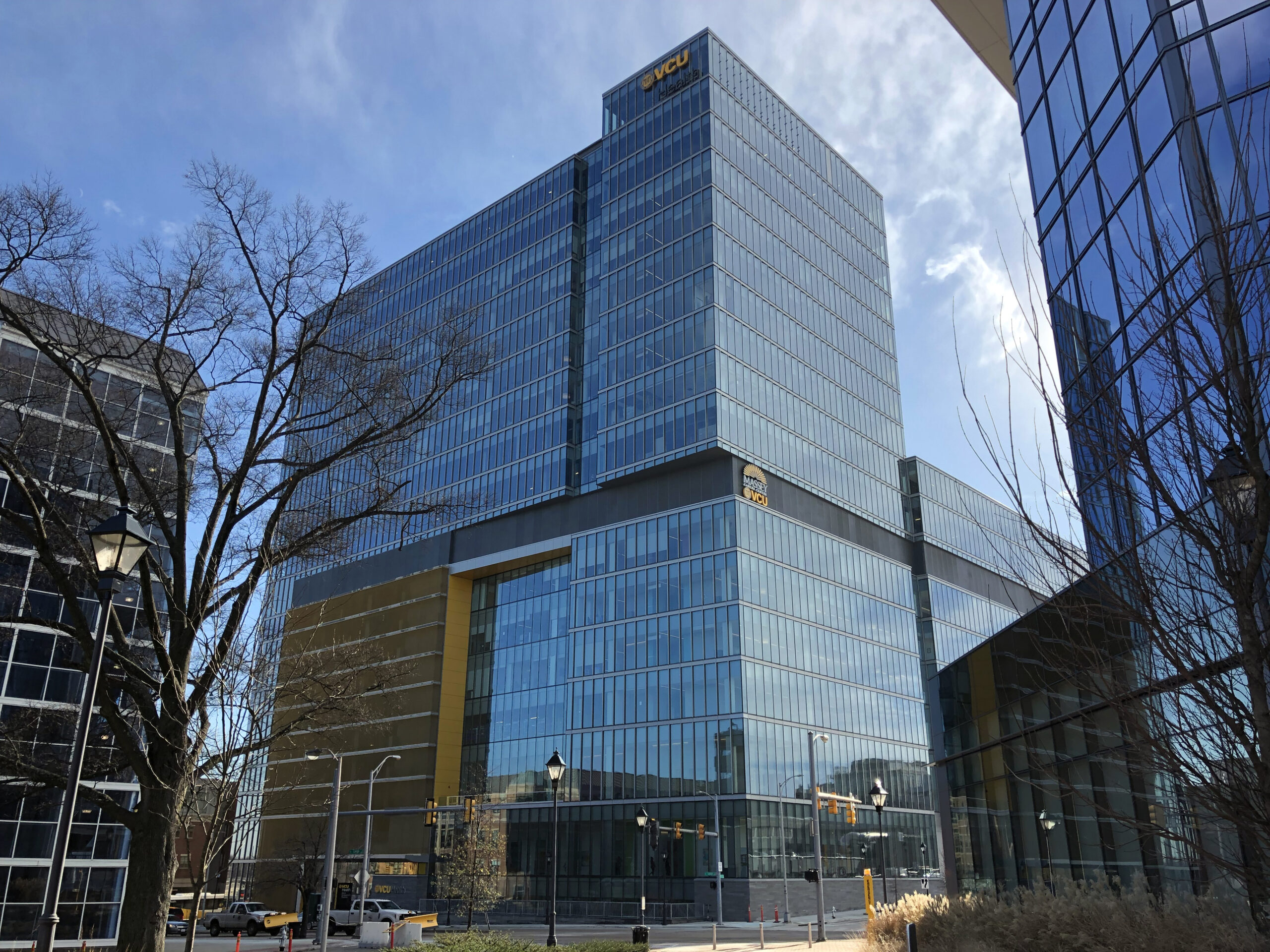
Last month another aspirational skyscraper, VCU Health’s Adult Outpatient Pavilion, opened its doors at 1001 E. Leigh St. in Navy Hill.
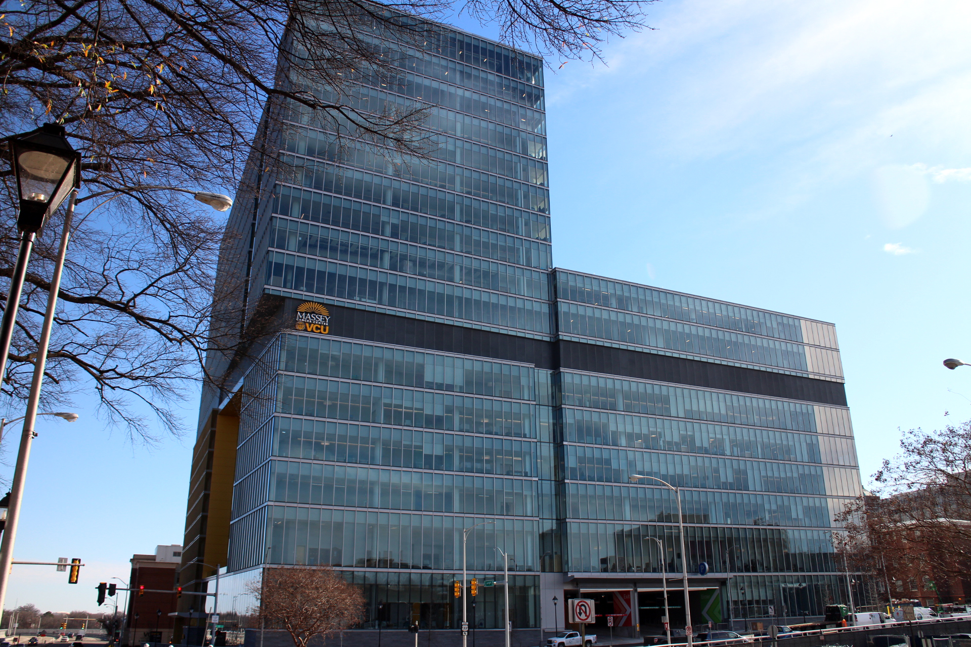
This 17-story, $384 million, clear glass-clad structure was designed by Omaha-based HDR, one of the nation’s largest architecture and design firms. Richmond-based Hourigan was the contractor. At 615,000 square feet, the Pavilion is the largest structure at VCU Health, besting West Hospital, the distinctive 18-story, Art Deco landmark that has graced the intersection of Broad and 11th streets since 1940.
The sleek new Pavilion consolidates a myriad of outpatient clinics, programs and services that formerly were provided in seven other buildings. These include the Massey Cancer Center, which occupies five floors of the new facility. And importantly, there is on-site patient parking aplenty — 1,000 spaces on 10 levels.
Convenient vehicular access has perennially been a challenge for the burgeoning medical center, which is landlocked by steep hillsides and interstate highways on its eastern and northern sides, the state government complex on the south, and ill-defined blocks of municipal buildings and the Virginia Biotechnology Center on the west.
And when threading the needle as to how to expand physically or remodel, VCU Health must also consider the deep reserves of buildings listed on the federal National Register of Historic Places that populate its campus. These include Monumental Church, First African Baptist Church, and Hunton Hall (formerly First Baptist Church). The new Pavilion does a passable job of blending with the landmarks and older blocks of the campus since its footprint respects and reinforces the historic urban street by meeting the edge of city sidewalks along East Leigh, North Tenth and North 11th streets.
The scale and massing of the Pavilion is most pleasing when viewed from Leigh traveling east. The continuous sheath of glass across the ‘L’ shaped 10th Street facade is modernist minimalism at its best. Unfortunately, such is not the case when viewing the building from the opposite direction. The 11th street facade, when seen from the Martin Luther King Bridge, reveals 10 levels of an open parking garage screened by a flimsy-looking, yellow, metallic curtain. It draws unnecessary attention to itself. A companion with whom I was crossing the bridge likened this facade to a heavy-loaded container ship. One mitigating factor for the yellow hue is that gold and black are VCU’s school colors.
Since the building was designed for future expansion on its south side, those exterior walls are currently raw and unfinished in appearance. Another jarring visual feature is the slight torque the tower follows on the upper 10 floors. This is most apparent at the corner of Leigh and 10th streets. Since the twist isn’t at enough of an angle to be dramatic or interesting, it detracts from the simplicity of the building’s exterior.
Reservations about the exterior, however, fade upon entering the building from East Leigh near 11th Street (there are other entrances directly from the parking garage on higher levels). Inside, the architect has managed the seemingly impossible by creating a sense of light and weightlessness so that the building’s heft all but disappears. Credit the high ceilings and outer glass walls in the outer lobbies that follow the perimeters of the building on most floors. The floor-to-ceiling windows with narrow mullions provide magnificent vistas of downtown and beyond. Walls and floor spaces are painted the lightest and softest shades of beige, green, blue and gray. Chairs in the outer lobby/reception areas and in the ground floor cafe are comfortable and casual. The Pavilion feels more like an elegant contemporary hotel than an institution. There are also striking photo murals in strategic traffic areas, such as elevator lobbies, which feature natural scenes. And a plethora of some 1,000 original and worthy artworks hang in public spaces as well as in examining rooms.
If the VCU Health Outpatient Adult Pavilion was designed to deliver a soothing patient experience, it succeeds. It also adds a bonafide skyscraper, Richmond scale, on the edge of Navy Hill, perhaps a harbinger of better design to come to this architecturally fractured part of town.


It’s a pleasure to read Slipek’s articulate commentary on the latest addition to Richmond’s skyline! That VCU has completed a handsome modern building with generous parking on its medical campus is cause for celebration. Thanks Ed, kudos to VCU, and hooray for Richmond BizSense giving voice to an insightful observer of current urban design.
Happy to see Edwin Slipek added as a contributor to BizSense. His perspective offers a keen eye to assessing the developments in Richmond’s urban landscape — his commentary is enlightening and thought provoking.
He so eloquently found the words to describe the new space from a patient’s perspective. The space has a calming effect. I wanted to just sit back relax and stay awhile.
Love reading these articles! I worked on the civil site design for this project. As you hit on right in the first three words, one of the goals for this site was to improve vehicular access into the MCV campus and to improve 10th and 11th Street and their connections to Clay and Leigh. These improvements, along with other complimentary projects, are in keeping with the ONE VCU Master Plan to reimagine the campus front doors and help improve pedestrian access within the campus interior.
Even in the short time that “Style” was out of action, I sorely missed the contributions of Ed Slipek. Richmond is lucky to have what most cities don’t: a gifted architectural critic with a keen understanding of the city’s history and built environment. If VPM’s newly rebooted online version of Style doesn’t reinstate Slipek as its architectural contributor, I hope Richmondbizsense will make him a regular.
Thank you for the review – this project has been hugely important for all. I work for HDR and I signed and sealed the drawings. I would just like it noted that although HDR is headquartered in Omaha, this project was performed by the Richmond based office. Its important for all to realize this work was done with local talent (architectural & engineering)
I can attest to the fact that the 10 levels of parking are definitely needed. I go to VCU Health for both medical and dental care and there have been numerous times I’ve driven through the entire main parking deck, from top to bottom, only to find that not a single space is available.
Just as the new facility brings a sense of comfort, the golden words of Ed Slipek bring an equal sense of comfort to this gentle reader. While the demise of Style is Richmond’s loss, seeing a Slipek review grace the Richmond Biz Sense site is certainly the publication’s — and all of our — gain.