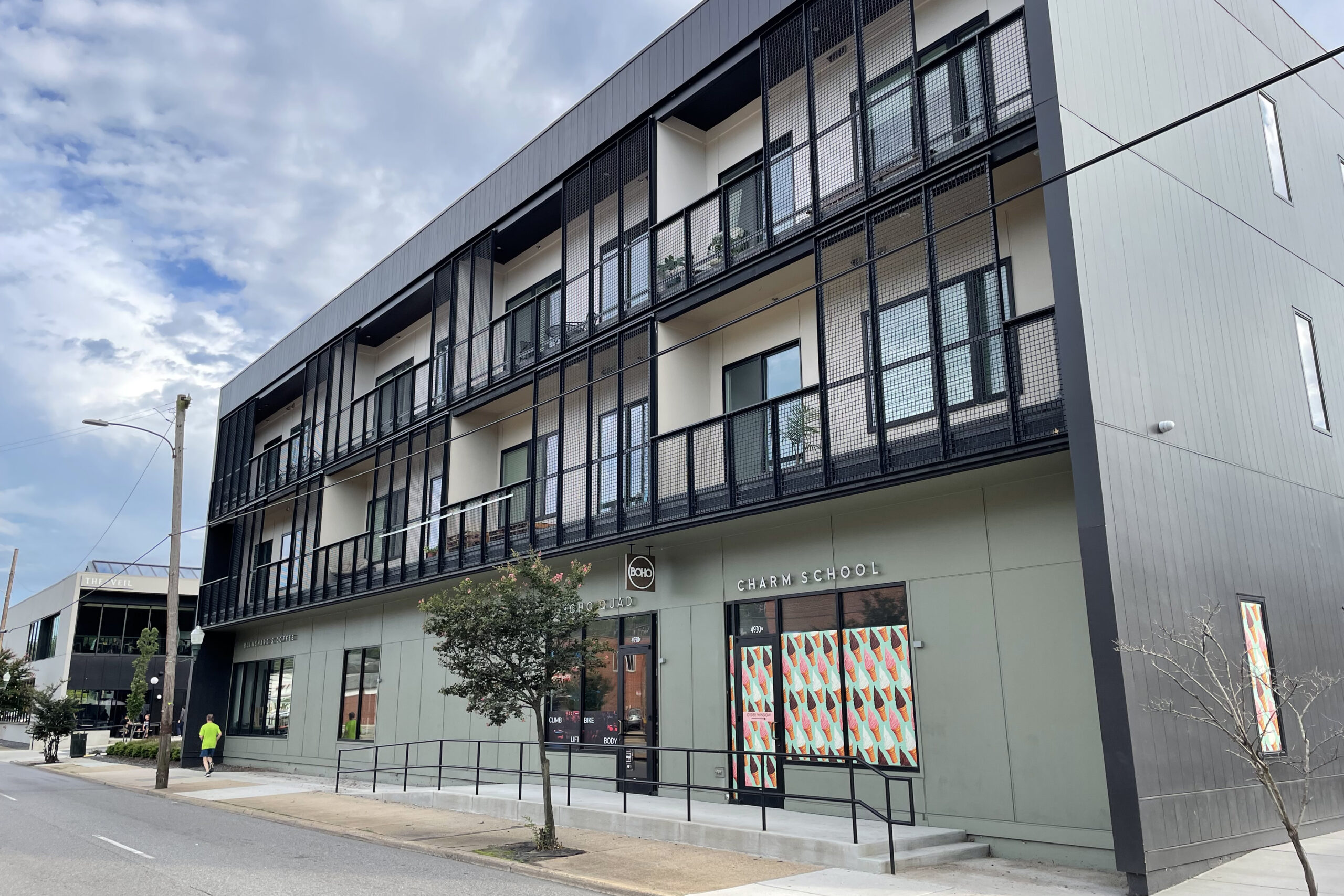
The Hill Standard apartments sit on the western part of the site, with the Veil’s building in the distance. (Michael Schwartz photos)
To some, the two mostly black, boxy buildings that loom over the city sidewalk in the 4900 block of Forest Hill Avenue might be better placed aboard a container ship on the high seas than amidst the bungalows, Cape Cods, and colonial revival houses in the sedate Westover Hills neighborhood.
But look again.
The Veil Brewing Co. and its next-door neighbor, the Hill Standard apartment building that boasts a Stella’s Market, a Blanchard’s coffee shop, and a Charm School Study Hall ice cream and yogurt parlor, are successful and striking place makers on this aging commercial stretch of suburbia.
Until recently, Forest Hill Avenue here lacked anything resembling distinctive architecture. Sure, the Locker Room restaurant and pool hall, across the street at 5035 Forest Hill, possesses rough-hewn charm. And some will miss The Forest, a greasy spoon whose interior was adorned in paraphernalia glorifying the Pittsburgh Pirates, Penguins and Steelers; it’s been resurrected as Riverside Tavern. But the Veil and Hill Standard represent unapologetic nods to Modernism that inject Westover Hills with unexpected spunk. The complex was designed by the Richmond architecture firm of Fultz & Singh.
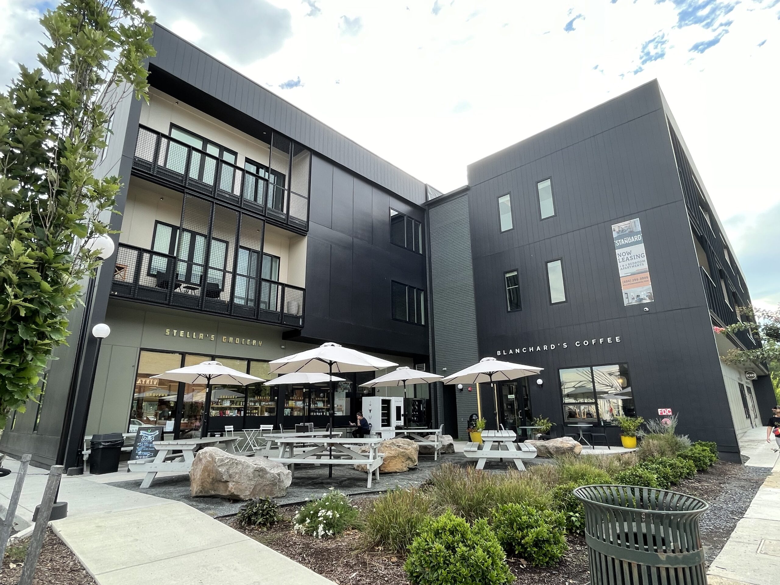
Stella’s Market and Blanchard’s Coffee are two of the tenants on the apartment building’s ground floor.
First off, Richmond has few buildings with aggressively black exteriors. We generally favor red brick, buff sandstone, or some derivative thereof. But there is inherent drama and intentionality in dark walls that exude confidence on the part of architect, clients and tenants. Add disciplined design to the mix and suitability to the purpose for the building and results can be striking.
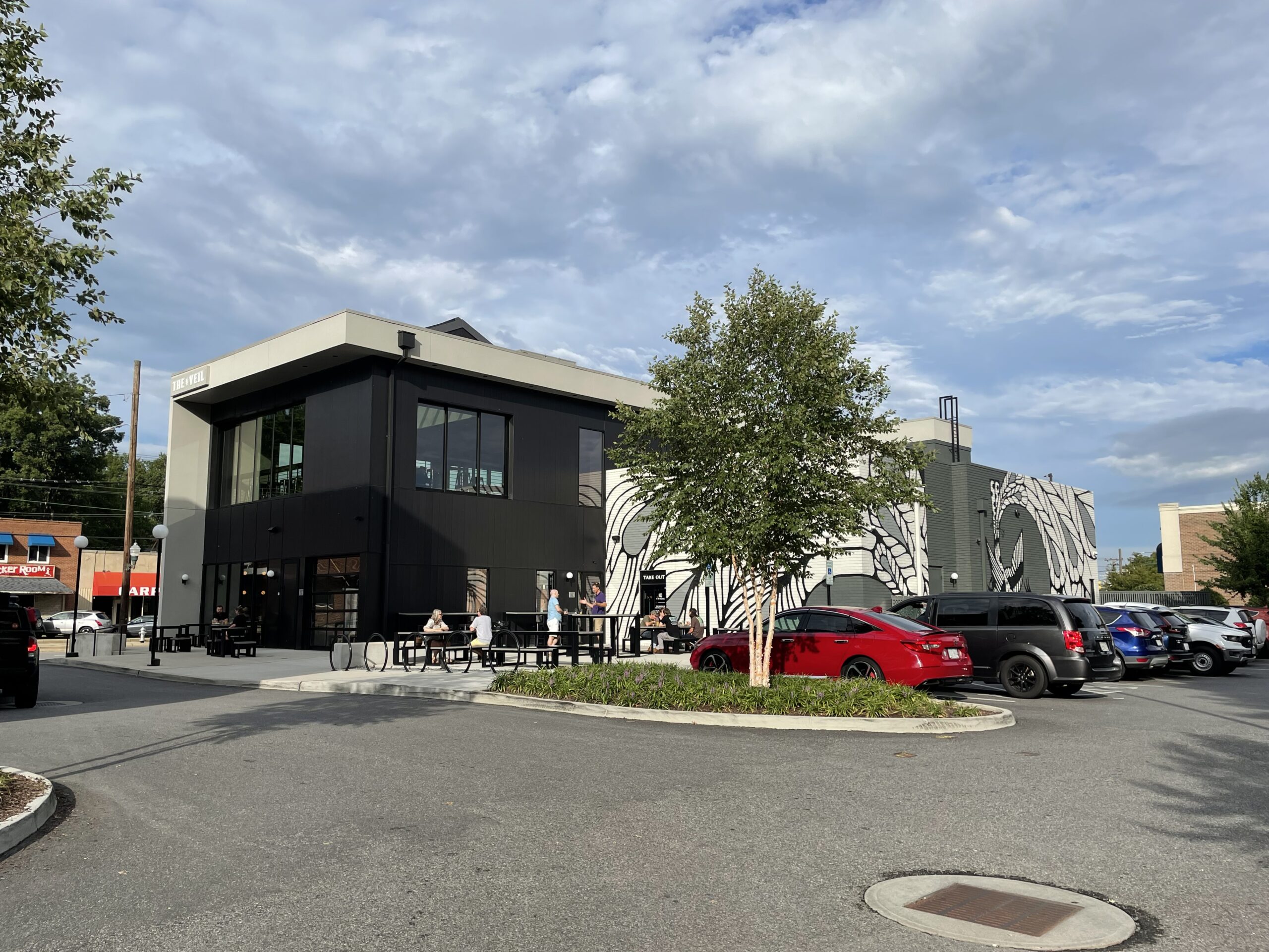
The Veil is the smaller of the companion buildings. Each of its two floors are punctuated with large windows that keep the minimalist structure from seeming oppressive. Customers enter the large tasting room (which also offers Y Tu Mama cuisine) from the west end of the building and are confronted with various grids. There are 27 white glass globe-like lighting fixtures aligned on the north wall. The black rectangular tables are arranged in a grid that aligns with the directional pull of the space. Even the dramatic menu board, projected electronically above the bar, is so sharply designed that it forms a grid.
A steep interior metal staircase leads to the second floor. A reward for the climb is viewing the sweeping mural on the south wall of the tasting room. Fashioned in red neon, it depicts a huge gila monster approaching the underworld. Tim Skirven was the artist (he is known also for his tattoo work). The piece injects the only color to the overall enterprise.
From this grand, second floor space a large plate glass door opens at the western end of the room onto an enclosed porch. “It’s like a treehouse,” quipped a customer sitting at a sleek black table nearby. The large sheer windows on the remaining three walls open to connect visually with the surroundings. The rear window frames the well-kept playing field near the neighboring Westover Hills Elementary School and the mature shade trees that frame it. Since the building is set tight against the city sidewalk, the vistas toward Forest Hill Avenue containing mid-20th century commercial buildings make them appear more dignified than before the arrival of the two land yachts. Even the large aluminum clock on the wall of the red brick Westover Provisions building across Forest Hill looks striking.
On a recent rainy afternoon I visited The Veil with friends. This enclosed porch was occupied by a party of 12. It was a pulled together, three-generational family that had made itself very much at home. Toys were strewn about. A septuagenarian great uncle was on the floor playing with a rambunctious 3-year-old while, nearby, the boy’s blonde mother nursed his brother. Other customers adjusted their movements and imbibed good-naturedly. There was something reassuringly normal about witnessing a family reunion after months of pandemic.
The Hill Standard apartments, situated to the immediate west of the Veil, is a three-story, L-shaped building. Its mass is broken by continuous balconies on the north and south facades that connect with the housing units on the two upper floors. The starkness of this building is broken by wire-meshing that creates another grid. Units are promoted as ranging in size from some 800 to 1,300 square feet.
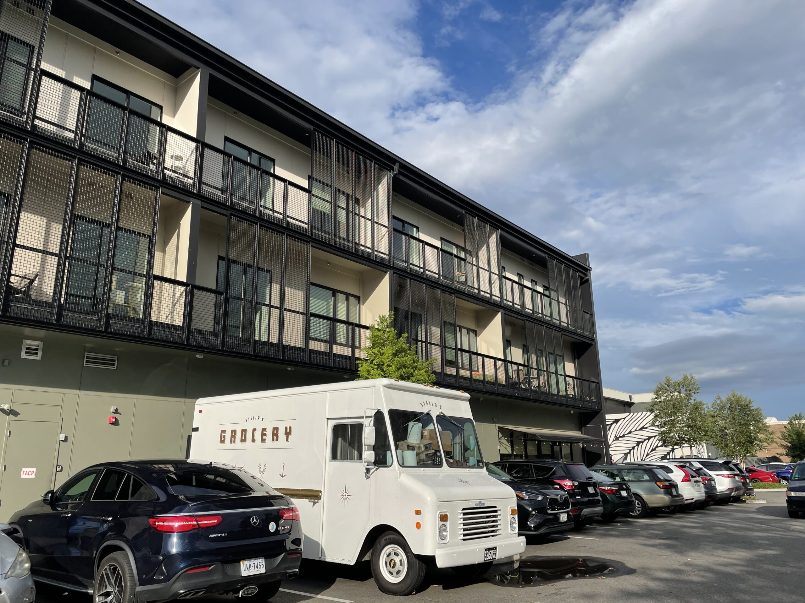
Surface parking for both residents and retail customers is at the rear of the two buildings. This is important to the overall success of the design of the complex. Other buildings along this stretch of Forest Hill Avenue are set back from the city sidewalk behind parking spaces. This creates an overall fractured streetscape. At the nearby, busy intersection of Westover Hills Boulevard and Forest Hill Avenue two dueling national drugstores, a service station and a former dry cleaners anchor the four corners, all set back behind asphalt. This bow to the automobile is understandable since the neighborhood was not developed as a streetcar suburb but an automobile neighborhood. In fact, the Boulevard Bridge (whose toll was once 5 cents) was built in 1925 by private developers intent on connecting their upscale Southside development with the West End. Now, newbies the Veil and the Hill Standard are as urban as they are urbane. In addition to hiding the vehicles, pedestrian activity on the city sidewalk is encouraged by an outdoor seating area in front of the handsome Stella’s and Blanchard’s operations.
This patio, however, is the only space within the overall complex where achingly precise attention to design hasn’t materialized. Clunky wooden picnic tables, like those found in a park, were painted white but they are too large for the intimate outdoor space and delicate landscaping. Outdoors nearby, the haphazard arrangement of mismatched chairs creates a cluster of visual confusion at the entrances of Stella’s and Blanchard’s.
Overall, the Veil and Hill Standard architectural show is so tight it’s time to tidy up the opening act at some of the front doors.

The Hill Standard apartments sit on the western part of the site, with the Veil’s building in the distance. (Michael Schwartz photos)
To some, the two mostly black, boxy buildings that loom over the city sidewalk in the 4900 block of Forest Hill Avenue might be better placed aboard a container ship on the high seas than amidst the bungalows, Cape Cods, and colonial revival houses in the sedate Westover Hills neighborhood.
But look again.
The Veil Brewing Co. and its next-door neighbor, the Hill Standard apartment building that boasts a Stella’s Market, a Blanchard’s coffee shop, and a Charm School Study Hall ice cream and yogurt parlor, are successful and striking place makers on this aging commercial stretch of suburbia.
Until recently, Forest Hill Avenue here lacked anything resembling distinctive architecture. Sure, the Locker Room restaurant and pool hall, across the street at 5035 Forest Hill, possesses rough-hewn charm. And some will miss The Forest, a greasy spoon whose interior was adorned in paraphernalia glorifying the Pittsburgh Pirates, Penguins and Steelers; it’s been resurrected as Riverside Tavern. But the Veil and Hill Standard represent unapologetic nods to Modernism that inject Westover Hills with unexpected spunk. The complex was designed by the Richmond architecture firm of Fultz & Singh.

Stella’s Market and Blanchard’s Coffee are two of the tenants on the apartment building’s ground floor.
First off, Richmond has few buildings with aggressively black exteriors. We generally favor red brick, buff sandstone, or some derivative thereof. But there is inherent drama and intentionality in dark walls that exude confidence on the part of architect, clients and tenants. Add disciplined design to the mix and suitability to the purpose for the building and results can be striking.
The Veil is the smaller of the companion buildings. Each of its two floors are punctuated with large windows that keep the minimalist structure from seeming oppressive. Customers enter the large tasting room (which also offers Y Tu Mama cuisine) from the west end of the building and are confronted with various grids. There are 27 white glass globe-like lighting fixtures aligned on the north wall. The black rectangular tables are arranged in a grid that aligns with the directional pull of the space. Even the dramatic menu board, projected electronically above the bar, is so sharply designed that it forms a grid.
A steep interior metal staircase leads to the second floor. A reward for the climb is viewing the sweeping mural on the south wall of the tasting room. Fashioned in red neon, it depicts a huge gila monster approaching the underworld. Tim Skirven was the artist (he is known also for his tattoo work). The piece injects the only color to the overall enterprise.
From this grand, second floor space a large plate glass door opens at the western end of the room onto an enclosed porch. “It’s like a treehouse,” quipped a customer sitting at a sleek black table nearby. The large sheer windows on the remaining three walls open to connect visually with the surroundings. The rear window frames the well-kept playing field near the neighboring Westover Hills Elementary School and the mature shade trees that frame it. Since the building is set tight against the city sidewalk, the vistas toward Forest Hill Avenue containing mid-20th century commercial buildings make them appear more dignified than before the arrival of the two land yachts. Even the large aluminum clock on the wall of the red brick Westover Provisions building across Forest Hill looks striking.
On a recent rainy afternoon I visited The Veil with friends. This enclosed porch was occupied by a party of 12. It was a pulled together, three-generational family that had made itself very much at home. Toys were strewn about. A septuagenarian great uncle was on the floor playing with a rambunctious 3-year-old while, nearby, the boy’s blonde mother nursed his brother. Other customers adjusted their movements and imbibed good-naturedly. There was something reassuringly normal about witnessing a family reunion after months of pandemic.
The Hill Standard apartments, situated to the immediate west of the Veil, is a three-story, L-shaped building. Its mass is broken by continuous balconies on the north and south facades that connect with the housing units on the two upper floors. The starkness of this building is broken by wire-meshing that creates another grid. Units are promoted as ranging in size from some 800 to 1,300 square feet.
Surface parking for both residents and retail customers is at the rear of the two buildings. This is important to the overall success of the design of the complex. Other buildings along this stretch of Forest Hill Avenue are set back from the city sidewalk behind parking spaces. This creates an overall fractured streetscape. At the nearby, busy intersection of Westover Hills Boulevard and Forest Hill Avenue two dueling national drugstores, a service station and a former dry cleaners anchor the four corners, all set back behind asphalt. This bow to the automobile is understandable since the neighborhood was not developed as a streetcar suburb but an automobile neighborhood. In fact, the Boulevard Bridge (whose toll was once 5 cents) was built in 1925 by private developers intent on connecting their upscale Southside development with the West End. Now, newbies the Veil and the Hill Standard are as urban as they are urbane. In addition to hiding the vehicles, pedestrian activity on the city sidewalk is encouraged by an outdoor seating area in front of the handsome Stella’s and Blanchard’s operations.
This patio, however, is the only space within the overall complex where achingly precise attention to design hasn’t materialized. Clunky wooden picnic tables, like those found in a park, were painted white but they are too large for the intimate outdoor space and delicate landscaping. Outdoors nearby, the haphazard arrangement of mismatched chairs creates a cluster of visual confusion at the entrances of Stella’s and Blanchard’s.
Overall, the Veil and Hill Standard architectural show is so tight it’s time to tidy up the opening act at some of the front doors.



Humble thanks to Professor Slipek for another great review and commentary on a cool Richmond neighborhood. I have a personal connection to this stretch of Forest Hill Avenue – I grew up in Granite — less than a mile west of the intersection of Forest Hill and Westover Hills Boulevard — my doctor’s office was in the old Cox Medical Building (long since gone in favor of the Walgreen’s parking lot). I spent a lot of time when I was a kid in what was a really neat little retail neighborhood. This new development is on the site of what… Read more »
I remember the cages at the old zoo I visited in my old hometown. When I see these apartments with “balconies” that measure18” wide and the wire mesh I wonder about the interiors of these apartments and the impact of these architectural gems. How are the two legged animals doing?