Virtual college tours weren’t an option 55 years ago when William Darwin “Bo” Prillaman left Martinsville, Virginia, and arrived cold turkey at Virginia Commonwealth University. He recalled his first sight of the Monroe Park campus in his heartfelt and finely illustrated book, “Richmond in Watercolor: Dining out + Drinking in.” It’s a valentine to many of our city’s iconic restaurants that Prillaman, an artist and architect, published in 2021 to benefit local eateries during the COVID-19 pandemic.
“I first arrived in Richmond in the late 1960s,” Prillaman wrote. “RPI [Richmond Professional Institute] had just been rebranded as VCU where I was enrolled as a freshman. I had a great little Triumph TR4 convertible, a small suitcase and two or three golf clubs in the back. I was on my way to college!”
He continued: “I had a map of Virginia and a map for my new college. As I cruised down Franklin Street, I stopped in front of the Hibbs Building where I was very puzzled to be at the address where I was meant to begin my advanced academia. But there was certainly no college there.” He engaged a young man standing nearby: “‘Can you tell me where VCU/RPI is?’ His eyes were a bit glazed over. After a slow, 360 degree turn, his arms raised, his reply was, ‘It’s everywhere, man.'”
Bo, as you know, it’s even more everywhere now. VCU is the city’s largest employer and physically hugs East and West Broad Street with the medical and health campus perched above Shockoe Valley and the verdant Monroe Park campus abutting the Fan, Oregon Hill and Carver neighborhoods. Other VCU facilities are popping up downtown between these bookends. Recently, construction of a new performing arts building received the green light. It will occupy the entire south side of the 500 block of West Broad at Belvidere Street.
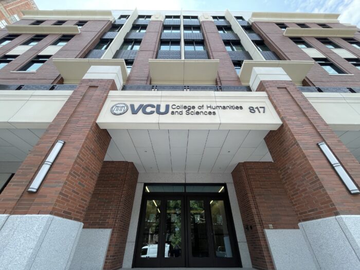
But despite the university’s transformative expansion since 1968, the 800 and 900 blocks of West Franklin Street (where VCU’s academic campus’ roots were permanently planted in 1924) have changed little architecturally. VCU has sensitively refurbished and repurposed this tight necklace of late 19th- and early 20th-century former residences (and a handful of century-old apartment buildings) to serve the educational juggernaut. This spring, however, an architectural interloper has been injected into the tightly configured streetscape at 817 W. Franklin St. (on the site of the former Franklin Street gym).
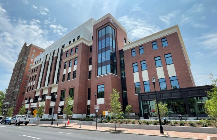
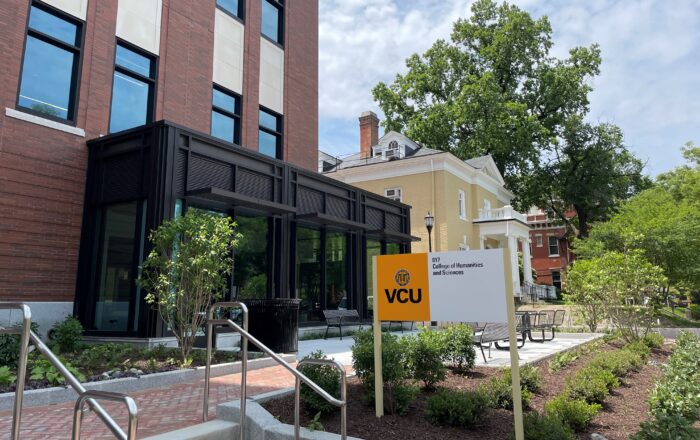
This much-heralded, six-story, 168,000-square-foot, $125 million STEM (Science, Technology, Engineering and Mathematics) Building was designed by two firms, Ballinger and Quinn Evans architects. Hourigan was the contractor. The excitement is understandable since the school has sorely lacked enough adequate teaching facilities since its founding, even basic classrooms. The new STEM building, with red brick walls and cream-colored trim, opens none too soon with the fall semester.
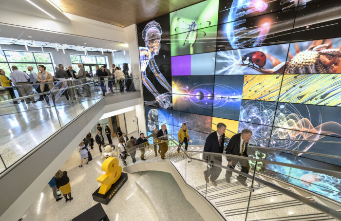
The building’s interior delivers big time. First, for such a large building, the north-south and east-west cross-axial halls and passages make the various multipurpose spaces, lecture halls, labs, classrooms and offices conveniently readable and reachable. And there is light. On the second-floor lounges, reached from the Franklin Street entrance lobby via a grand, slightly curved stairway, large windows on the north and south sides of the structure provide views through the center of the building. The windows overlooking Franklin Street open onto a balcony. The windows on the opposite, south side of the building frame magnificent views of the towering dome of the Cathedral of the Sacred Heart (foliage permitting; we’ll wait for winter for the full effect). On the upper floors, many inner walls are defined by floor-to-ceiling glass to encourage interaction. The furnishings throughout the building are comfortable, handsome and plentiful. Vivid colors in the décor make the common areas visually upbeat.
The School of Humanities and Sciences, whose programs populate this building, reportedly serves 60 percent of the Monroe Park undergraduate population. Next year, I’d bet on a spike in the flow of tuition checks from the pool of accepted students who will have visited the STEM facility in person.
But the exterior, sorry to say, is a clunker amid its domestic-sized Franklin Street neighbors – like an oversized cruise ship docked at a comparatively diminutive port, say Key West or Dubrovnik. True, the STEM building is necessarily massive and replaced the sprawling old gym that had no hint of distinction visually. But the architectural elements on the outside are maddening.
There are oversized windows, high contrasting light-hued trim and ill-proportioned faux classical trim. And what are those bizarre flap-like window overhangs that are attached, too high, above the upper floor windows? For crying out loud, this is the north side of the building! Why any need to block the light? The attempt at classical cornices on each of the building’s major front five bays looks flimsy. And while the rusticated brick pattern at the base of the main block of the building is well intentioned, the thickness of each grouped course of combined bricks isn’t bold enough for such a large structure.
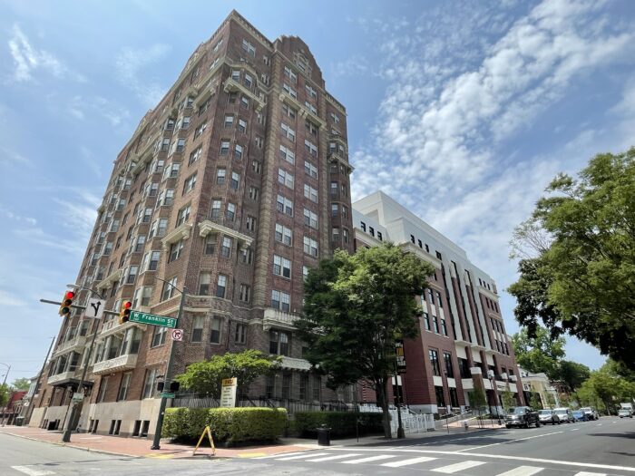
What was the bold architectural concept? It’s clear that the architects pondered the tricky site, wedged as it is between Johnson Hall, a century-old high-rise dormitory, and the Ritter-Hickok house, a 19th-century farmhouse that now houses the admissions office. To mitigate the shock to the historic Franklin Street fabric from such a massive building, it’s obvious the architects did try to minimize the mass. First, they respected the adjacent high-rise dorm by setting the fifth bay back from the property line so that it almost acts as a hyphen to its neighbor. The corresponding, opposite bay on the Ritter-Hitchcock side of the STEM building, however, is mostly shorn of decorative gee-gaws and suggests the modern International Style. (Interestingly, this is the most successful segment of the front façade.) It serves as a transitional connector to a lower, four-story wing that is set back considerably from the city sidewalk in respect to the scale of Ritter-Hickok house. And suffice to say the open space between the new educational building and Ritter-Hickok, which connects pedestrian traffic with the dining hall on Park Avenue, is underwhelming.
The architects were earnest. They checked most of the boxes to reach a contextual solution, but to little effect. Weirdly, the designers also may have been channeling the ghost of the Franklin Street gym itself in their thinking. That building’s main block, too, had a poorly articulated columned portico and an overwrought front staircase. The gym also had an International Style wing on its western end. But what do we make of what appears to be a last-minute addition, the modernistic, one-story, mostly dark glass, cube-like pavilion? Is this outlier paying homage to another mostly glass, but Edwardian age, folly on campus? That would be the Scott House at 909 West Franklin.
Despite the successful goings-on inside the new STEM building, its exterior is not clever. It’s schizophrenic.



It’s not terrible. As I have long noticed, the preferred Richmond style appears to be the “Don’t Look At Me”Vernacular. To an extent, even the beautiful old buildings in the beautiful old sections seem conservative for their time — best described as “a fine example of…” but never “the finest example” or “Unique” Exceptions seem rare. The Egyptian Medical school builing. Old City Hall. Even the overrated State Capital was Me Too for the time as is Georgian (How many old US Colleges have I visited that have boring Georgian sections? As I often do, I go back to another… Read more »
Does the building work for the occupants? All too often the focus is on the exterior (which is important), but buildings should be about the people who use them. Can we hear more about the inside of buildings in RVA and whether they perform as well as their facades?
Yes. I was thinking about this issue too and this sort of Howard Roarkian Form should follow function concern truly DOES tend to matter to the people who sign off on the plans, especially the guys who commission school buildings (I grew up with a guy who is a big city school architect and can tell you that bigwigs want things that are okay is on the outside but check a lot of positive things, light light-filled, on the inside — meanwhile, in the past, even on the campi of some elite old colleges some the buildings are impressive on… Read more »
Even a slight nod to the neoclassical architecture of our city would be nice. It doesn’t have to look like the Dakota Building in NYC (although a gorgeous building). It could still have dormers, spandrels, niches, balconies, balustrades, or even a few columns all reinvented in new ways. I’ve always loved how the original film Blade Runner reinterpreted Renaissance Revival architecture and made it look modern and classical at the same time. Maybe these architects should watch a few old movies, or just drive around Richmond and get some inspiration from what’s left of our old and beautiful buildings.
I am a big fan of all of these architectural elements, but ya gotta understand that anytime you break up a roofline, you have more upfront and future expenses — every time you make a balcony you create possible revenue for lawyers and actual porches mean less possible air conditioned spaces — which leads to ANOTHER issue — the push to save energy which is not a horrible God to serve even if the practice does often get a bit perverse. Architecture has ALWAYS been a practice of compromises. Did you know the Mansard roof was developed to skirt (one… Read more »
I appreciate your well thought out reply, but I disagree with you. Most architecture is impractical (except for maybe a Costco building). The French didn’t need the Cathedral of Notre-Dame to worship the Virgin Mary (they could have gathered in a barn), but architecture is an important art form, and art is not about practicality, and the world gains from this impracticality. It’s important to the soul, the culture, the intellect, etc. Of course the building does need to stand sturdily and perform its function (structure and use) which Notre-Dame did for nearly 1000 years. But it seems we’ve lost… Read more »
I read all these comments above as well as the essay critique of the STEM building and Leon’s comment above is the only one in plain English. ( And God, all that CAPITALIZATION!) Thanks Leon for speaking a language we mere mortals can understand.
Thank you, friend. I guess my years as a government technical writer weren’t all for naught. At least they taught me to be concise. Much appreciated!
Style is important in persuasion; that much is true.
Has the term “Humble Slam” been coined yet?
Though Style is my least favorite critical line on matters of substance you remain my favorite regular poster here.
I like this upvote/downvote thing but what frustrates me is the lack of criticism on the …… SUBSTANCE of what is being disagreed with.
Hopefully, in your case, you are only disagreeing with the sloppy style of my commentary, because if it is more than that, I would welcome …..THAT even more if it was indeed there lurking behind the English Comp lesson.
Thanks for the gentleness. It may be the verbosity of my comments, but I thought I touched on all your concerns. Yes, I actually have a BFA in studio art and was very impressed by Notre Dame — but one of my CENTRAL points still stands even regarding this example: Cathedrals tend to be designed to LOOK like they are defying gravity, but they of course aren’t — practicality, including gravity issues are ALWAYS involved in architecture. Also there are some problems with your example: a building that is specifically designed to evoke a state of mind needs some kind… Read more »