In 1919, when the first train chugged into Broad Street Station, West Broad Street was a barely paved, suburban road. However, by the early 1920s and with the popularity of automobiles, the thoroughfare was becoming the commercial strip it remains today. An Exxon, McDonald’s, Chanello’s Pizza, 7-Eleven, CVS, and, most recently, a Hustler Hollywood adult novelty store now vie for attention.
The environs of the Science Museum of Virginia, which has occupied the former train terminal since 1976, has also become a mixed-use neighborhood. In addition to the museum, anchors include the monolithic Virginia Department of Motor Vehicles building, the Children’s Museum of Richmond, the William Byrd Senior Apartments, the Interbake apartment building and a GRTC Pulse station. Sprinkled in are such popular small businesses as Sally Bell’s Kitchen, City Diner, William Byrd Hotel Barber Shop and the Broadberry music venue. Yes, it goes without saying that Scott’s Addition is rapidly injecting residential density to the area.
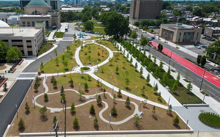
Recently another amenity, a public park, has joined the mix. Situated on the north side of Broad between Robinson Street and Terminal Place, the modest-sized but smartly designed and intelligently planted green oasis replaces a surface parking lot that had served both the science and children’s museums. Any time green space trumps peripheral highway infrastructure is a cause for celebration, so give three cheers.
Not only will the $4.5 million park serve the burgeoning residential population, but it enhances the setting of the Science Museum. This top-rung landmark, with Roman-infused architecture, was designed by John Russell Pope, who also conceived the Jefferson Memorial and National Gallery of Art in Washington, D.C. (see the family resemblance?).
After months of planning by the museum director, staff and consultants, the institution followed an updated master plan and converted the former 1.5-acre parking lot into a park. Officials wagered that this would animate the public facade of the popular museum as well as benefit the commercial and residential neighbors. To compensate for the lost parking spaces, a 400-vehicle deck was built between the science and children’s museums. Compared to the adjacent Science Museum, this structure, designed by Glave & Holmes Architects, is stoic. It reads as a deck but provides a lesson in how a support building can be contextual without being decorative or cloying.
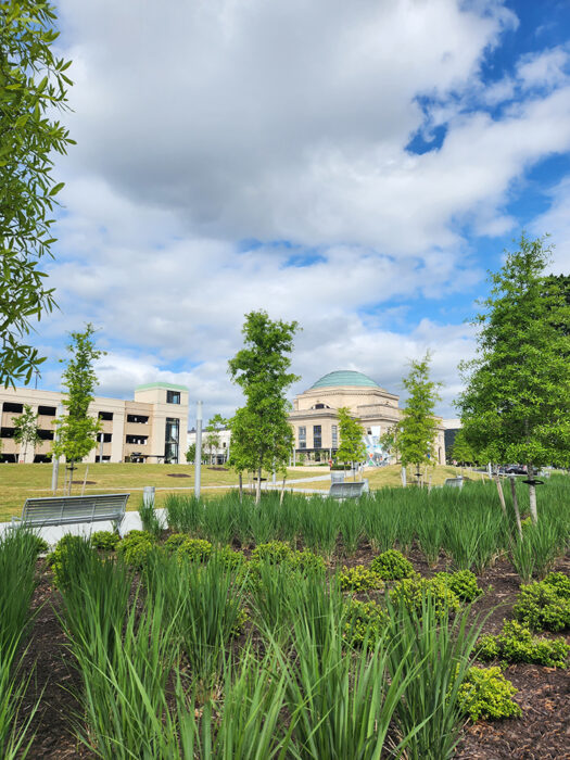
With the asphalt gone, the stage was set for the park, also a Glave & Holmes project. The tapestry of paved walkways, gravel pathways, hillocks and trees and plantings creates a strong sense of place. On a recent evening it was clear that area residents – with their dogs – are discovering the place. The park layout provides a series of outdoor “rooms” that allow visitors to make their own space while remaining part of the overall goings-on. These spaces will become even more attractive and well-articulated as the numerous shade trees mature. There are also ample and attractive metal park benches designed for comfort (not to deflect skateboarders).
Pedestrians enter the park from its four corners. This means that the southern border of the park, a blocklong stretch, is delineated by a low retaining wall and a wide border filled with indigenous plants. This serves as a buffer between the park and Broad Street with its noise from passing vehicles. This wide plant bed also delineates a broad, straight sidewalk that runs the length of the park; the English might call it “the long walk.” A huge legacy oak tree defines its eastern axis; the western end at Terminal is marked by a McDonald’s. Moving deeper into the park, a number of earth berms provide slight elevations in the topography. Of the various “rooms,” the one that should become a popular spot is a thicket of local evergreens – hollies, pines and cedars. As these trees grow they will subtly screen the park from commercial buildings.
But if the park is smart and understated in its design, its freshness contrasts with the front of the Children’s Museum, a ragged hodge-podge of structures, fencing, playground equipment and sculpture. Now that the unsightly surface parking is gone, that museum should up its game to bring its campus up to par with its new “gateway” park.
Bottom line, despite its newness and the ceaseless flow of Broad Street traffic, the park already exudes a tranquil sense of enclosure. And still you are constantly reminded of the urban surroundings; standing in the center of the park and making a 360-degree turn, you see that the rectangular park has distant architectural features that inadvertently define each corner. The Science Museum is at the northeast corner, the 11-story William Byrd marks the southeast entrance, the Interbake building is at the northwest, and the remarkable WTVR radio tower rises to 843 feet to the southwest.
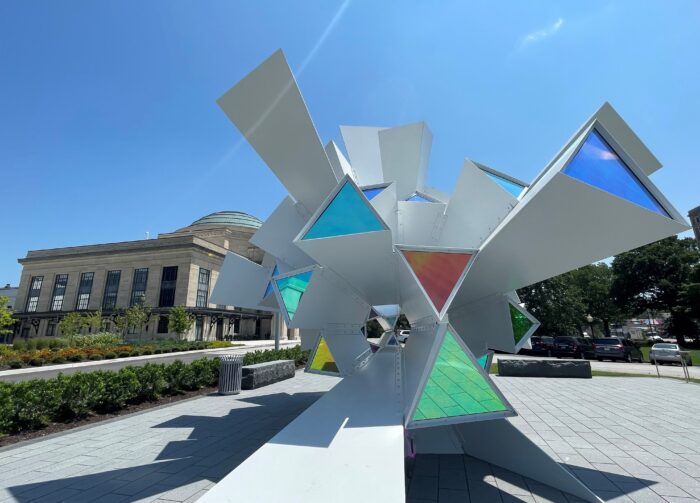
An intriguing nongreen aspect of the park is a commissioned sculpture that serves as a visual bridge between the park and the Science Museum itself. “Cosmic Perception” was designed by artists Shane Allbritton and Norman Lee. Its sharp angularity could not be more different from the soothing and enticing water piece, “The Grand Kugel,” at the museum’s main entrance. Surprisingly, it is carrying on a spatial conversation with the kugel. Check it out.
In addition to the Science Museum’s staff, consultants and architect, kudos to VHB designers, engineer PACE Collaborative and the Virginia Department of General Services. The task of reworking the grounds of the campus will continue this fall with a $3 million overhaul of the spaces immediately in front of the museum.
And the name of the new park? “The Green,” appropriately enough.


Nice review as always. Agreed on most points, however, I feel the parking deck, caries too prominent a role in the assemblage of buildings. It’s a lost opportunity to be a backdrop between the two architectural gems of different eras. Perhaps it’s intended to pay homage to the automobile, but even that could be done better. One can only hope the trees, once mature, effectively screen the black holed monolith from view. Some simple screening, green wall or a recessed deferential position would be all the deck needed to vastly improve it’s relegation to the site. Overall a good project.
I am confused by this comment. It seems you are saying the parking is too interesting, and then not interesting enough. The author asserts that it is “just nice enough” — that may be controversial, but it seems like it is true to me, since when I was in the garden looking at it I thought it looked nice, but it didn’t leave a huge impression. As far as my opinion goes, I am not sure I agree that adjacent buildings have to look like bridesmaids or aunts at weddings as if the built environment has to be some kind… Read more »
What might be nice is an ever changing mural or kinetic sculpture that’s attached to the side of the parking garage.
Parking!
What about it? The deck provides more than the old surface lot.
I am noting that parking has been mentioned in this article, and it amuses me to do so.
Yes, I am glad there is more parking!!! And I especially like it when parking goes VERTICAL!!! YEAH!!!
This Pope train station (yes, the guy was known for domes, wasn’t he?) is quite nice and grand — I wish it could be used for MORE than the Science Museum — seems like a lot of space is underused. We agree. I want more greenspaces in cities, but I am a realist too —- the “intelligence” of the plantings is only intelligent in that cities are notorious for not keeping up the maintenance of their plantings and things die. When my daughter and I discovered the new park, I pointed out to her that the plants were quite “common”… Read more »
Glave did a beautiful job with this project. The deck echoes the existing architecture without being a parody. It is exciting to see the first step in the redevelopment of this corridor!
Thanks to Art Helwig and Mr. Gottwald.
The Green’s implementation had me riding and walking by often and now I look forward to watching the trees and plants mature. Love this addition to W Broad St.
Nice to finally see some green space along Broad Street!
The architects did well in designing the space for daytime, much less so for nighttime. I wish the unshielded lights that were inexplicably and unnecessarily installed, would be removed. Save energy, help with saving the night sky.
Maybe they should put shielded ones in there — no doubt there is a reason for the lights though.
Whatever the reason, it is not following the science.
Even the tree well plantings are nice along Broad Street. Let’s hope the city uses this as a model and continues the plantings down West Broad and elsewhere. Scott’s Addition could certainly use some trees. The city should consider this when putting in the new sidewalks.
THANK YOU for saying the unspeakable — that Scott’s needs more trees, etc!!!
“What if we have dozens of unshielded LEDs at eye level blasting in people’s faces for no reason? I love it, send them the bill.” -The Architects. The lighting is a total disaster, an inexplicable assault on the senses after dark. For a place that hosts monthly astronomy observing sessions this is a completely baffling “L.”
Try to imagine, Stuart, a poorly lit park in the heart of downtown Richmond near residential buildings and two major museums which cater to children and evening events. The new park’s cylindrical, vertical LED lights lend excellent security to the park at night, and if you stop and think about it, the trees are going to grow and the lights will illuminate the trees from the inside out. Our chique new park shouldn’t have traditional street lanterns with incandescent bulbs, which are less energy efficient, high maintenance and provide less glow and security. Nor should we have shielded LED lights… Read more »
Ann, when you are walking at night do you get out a flashlight and shine it in your own eyes to see better? Of course not, you shine it down at the ground. That’s how street lights should work too, unlike these that emit light sideways. Re: shielded lighting, that feature is actually required by ordinance in parking areas so this doesn’t even meet UDC guidelines for lighting.
Our beautiful new park is neither a parking area nor a street.
Park lights should work the same as street lights, shining down, shielded light source, so as not to shine in the eyes of passersby and reduce ability to see.
Trees need dark hours too. Check with any horticulturist, master naturalist, arborist. The all night glaring lights are not healthy for the trees.
Glave and Holmes designed the beautiful atrium at Lewis Ginter Botanical Garden, I believe.
Despite the many positive aspects of The Green, the Science Museum’s planners, consultants, and management completely missed the mark when they designed the artificial lighting for this space! The light fixtures chosen for The Green are some of the worst, most light polluting they could have chosen. Excessive light (=energy) is wasted by shining out in the horizontal plane and above where it provides no useful function. This wasted light not only wastes energy but causes glare that is a safety hazard and the negative effects of unnecessary nighttime illumination on humans, wildlife and plants is well established in the… Read more »