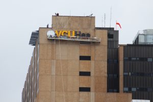
The many parts that make up the huge VCU Health System are now flying a new banner meant to join them all together.
VCU Health has been unveiled as the new brand for all parts of the system, including the downtown medical center, its MCV Physicians group, the system’s recently acquired hospital in South Hill, and the university’s health sciences schools.
Cynthia Schmidt, director of marketing for VCU Health, said the effort is an attempt to bring clarity and cohesiveness to the brand. The previous VCU Health System name, she said, was often mistaken as merely a reference to the downtown medical center.
“We needed a way to talk about ourselves that was bigger and was more inclusive than just a medical center,” Schmidt said. “We have a broader scope, and we’re a much broader organization than we were even five years ago.”
The new branding is made up of the official school seal, the letters “VCU” and the word “Health” in a design that also uses the university’s colors of black and gold.
Schmidt said the new brand has been in the works for several years, ever since the university underwent its own rebranding effort that resulted in the newer school seal: a circle design with an image of the historic Egyptian Building and the initials of the Medical College of Virginia and the Richmond Professional Institute, the schools whose consolidation formed VCU.
“While the business model of the university and a healthcare provider do seem different, we’re all part of the same institutional brand, and it’s important that we feel like we’re all supporting the same idea about what VCU is about and how this institution has evolved over these years,” Schmidt said.
The rebranding as VCU Health will come in the form of new signage, new letterhead and new uniforms, among other materials that will also feature the logo. While several signs have been placed already – a large sign went up on the interstate-facing side of the medical center’s North Hospital last week – Schmidt said most changes will be made gradually over the next several years, with changes made on an as-needed basis.
As a result, Schmidt said, costs associated with the rollout, which started in late August, are difficult to tally. The school worked on the project with Monigle Associates, a Denver-based branding firm, but Schmidt said the company’s fees for the effort are proprietary information.
The sign that went up on North Hospital last week replaced another that labeled the building as VCU Medical Center. Richmond companies Signs Unlimited and Superior Sign Productions are installing those signs and others with help from Associated Scaffolding.
Schmidt stressed that the branding is not just about signs.
“Part of this is helping our internal audience and everyone who lives and walks the brand every day to have better clarity about what this organization stands for,” she said. “A lot of us, we kind of forget we’re so much more than the buildings you see downtown.”


