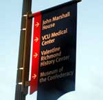
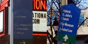
 Starting this winter, a New York firm hired by the city will overhaul the mishmash of signs that direct tourists to attractions downtown and along the Boulevard.
The project is in response to requests from local cultural institutions, businesses and tourist attractions to update the signage, according to Rachel Flynn, director of the city planning and development department.
The city will pay the consultants just over $100,000 to develop the new signs and has appropriated another $900,000 to have them made and put up, according to a city spokesman.
“Every bit of it could be spent, and we really want this done right. [The costs] can add up quickly, especially if it is a comprehensive package,” Flynn said.
Design firm Two Twelve Associates was awarded the project in partnership with local firm BAM Architects. Two Twelve’s previous clients include the cities of Charlotte, Baltimore and New York.
The signs to be replaced include those along the interstates and the ones along city streets.
 Much of the current signage is outdated, poorly placed and in disrepair. Where new signs have been added, old ones are still up, creating a confusing mix of color schemes, sizes and shapes.
“There are the red, white and blues ones that are the most recent, and the green and blue signs before that. It would be nice if we could stick with the most recent one,” Flynn said. “That is something we will work with the consultant on.
“This is what they do for a living. They know what colors are most eye-catching.”
Two Twelve and BAM Architects were among seven firms that responded to the city’s request and were reviewed by the city with the help of representatives from museums and cultural attractions.
Burt Pinnock, co-founder of BAM Architects, said his firm’s goal is to improve the experience for people visiting local attractions — and keep them from getting lost.
“Getting from a major gateway like 95 or 64, to, say, to riverfront, to the Coliseum, to Tredegar, to a parking deck, to fill-in-the-blank — there are a lot of big gaps in how all of that works,” Pinnock said.
Pinnock described a section in Shockoe Bottom where someone could end up driving in circles on one-way streets trying to follow signs to area destinations.
In the age of GPS and smart phones, that might not be as big of a problem as it once was, but Pinnock said updating the signage isn’t just about helping people get around more easily.
“Not only does it have to do with way-finding, it also has to do with brand identity of a metropolitan area. Also, as much as we rely on some of that technology, it’s not always the easiest thing.”
Scott Bergman, who owns Haunts of Richmond Ghost Tours, said he doesn’t hear too many customers complain about getting lost on the way to his tours’ departure points, one of which is at the Poe Museum in Shockoe Bottom.
“If you look for the signage, it is there. You’ll see it. It could be a little more eye-catching to guide people a little easier,” Bergman said.
He said that most people easily find the Poe Museum using online directions or a GPS and that he hasn’t had a problem with people not being able to find the place. But better signs could help draw in folks without a particular destination in mind.
“If you have a tourist coming from out of town that doesn’t have a strict agenda plan, suddenly they are going to rely on the signage,” Bergman said, “I am a definitely a proponent of making the various attractions crystal clear for someone who is that casual tourist.”
Al Harris is a BizSense reporter. Please send news tips to Al@richmondbizsense.com.
 Starting this winter, a New York firm hired by the city will overhaul the mishmash of signs that direct tourists to attractions downtown and along the Boulevard.
The project is in response to requests from local cultural institutions, businesses and tourist attractions to update the signage, according to Rachel Flynn, director of the city planning and development department.
The city will pay the consultants just over $100,000 to develop the new signs and has appropriated another $900,000 to have them made and put up, according to a city spokesman.
“Every bit of it could be spent, and we really want this done right. [The costs] can add up quickly, especially if it is a comprehensive package,” Flynn said.
Design firm Two Twelve Associates was awarded the project in partnership with local firm BAM Architects. Two Twelve’s previous clients include the cities of Charlotte, Baltimore and New York.
The signs to be replaced include those along the interstates and the ones along city streets.
 Much of the current signage is outdated, poorly placed and in disrepair. Where new signs have been added, old ones are still up, creating a confusing mix of color schemes, sizes and shapes.
“There are the red, white and blues ones that are the most recent, and the green and blue signs before that. It would be nice if we could stick with the most recent one,” Flynn said. “That is something we will work with the consultant on.
“This is what they do for a living. They know what colors are most eye-catching.”
Two Twelve and BAM Architects were among seven firms that responded to the city’s request and were reviewed by the city with the help of representatives from museums and cultural attractions.
Burt Pinnock, co-founder of BAM Architects, said his firm’s goal is to improve the experience for people visiting local attractions — and keep them from getting lost.
“Getting from a major gateway like 95 or 64, to, say, to riverfront, to the Coliseum, to Tredegar, to a parking deck, to fill-in-the-blank — there are a lot of big gaps in how all of that works,” Pinnock said.
Pinnock described a section in Shockoe Bottom where someone could end up driving in circles on one-way streets trying to follow signs to area destinations.
In the age of GPS and smart phones, that might not be as big of a problem as it once was, but Pinnock said updating the signage isn’t just about helping people get around more easily.
“Not only does it have to do with way-finding, it also has to do with brand identity of a metropolitan area. Also, as much as we rely on some of that technology, it’s not always the easiest thing.”
Scott Bergman, who owns Haunts of Richmond Ghost Tours, said he doesn’t hear too many customers complain about getting lost on the way to his tours’ departure points, one of which is at the Poe Museum in Shockoe Bottom.
“If you look for the signage, it is there. You’ll see it. It could be a little more eye-catching to guide people a little easier,” Bergman said.
He said that most people easily find the Poe Museum using online directions or a GPS and that he hasn’t had a problem with people not being able to find the place. But better signs could help draw in folks without a particular destination in mind.
“If you have a tourist coming from out of town that doesn’t have a strict agenda plan, suddenly they are going to rely on the signage,” Bergman said, “I am a definitely a proponent of making the various attractions crystal clear for someone who is that casual tourist.”
Al Harris is a BizSense reporter. Please send news tips to Al@richmondbizsense.com.


$1 million of your taxes for NEW signs. Where is the outrage? At the very least this could have been done by a local marketing firm to keep revenue generating in the city. Was there not one firm that could have done this? …Anyone? That would have been less expensive, kept the tax dollars in the city and perhaps create jobs and return more tax revenue to the city. But don’t expect your city to understand economics… hence don’t be surprised when your taxes go up.
Unbelievable.
Maybe no local firms bid on the project, ever think of that Greg? Or maybe they did and sucked. You want to spend more money on crappy signs?
As a marketer, I believe that signage is one of the great overlooked sales and branding tools, and I think the expense is a smart investment. Signage can set the tone for the character of a neighborhood, and in that case, help create value and a cohesive story that helps to sell the city to tourists. If anything, the city should be investing in more signage (and perhaps some sculptural art) near the interstate to pull tourists off the highway. Richmond is a gem in need of polishing. Kudos to the city and Rachel Flynn for moving us in the… Read more »
I hope this project addresses the difficulty in finding Maymont. I spend a lot of time in Byrd Park and people are always asking me about Maymont, because the signage is lacking. The way S Boulevard/Blanton Ave/Park Drive meander and turn is highly confusing and there really needs to be clear directions for each turn. On top of that confusing set of roads, there’s a separate set of signs pointing visitors to the Nature Center entrance. All of the signs are rather small and oddly placed. I imagine a lot of visitors also get distracted by everything going on in… Read more »
Large maps that identify the locations of attractions on major corners would be helpful as well. Something similar to the ones on VCU’s campus. They could tie it all together nicely. Lots of cities have these.
I agree with Greg. One million for signage does seem excessive, especially $100k to develop a sign brand. Richmond is famous for granting contracts to out of state vendors. Surely, there are competent companies within Virginia that “know what colors are most eye catching”. At least Richmond had the wherewithal to hire local BAM Architects to assist on the project.
I have to agree with Greg in part. There was no design firm in the city of Richmond to handle this project? VCU cranks out hundreds of designers from the undergraduate and graduate programs as well as the Design Center. Also, I don’t think the ones that exist are that bad. If I were Flynn, I would have some one photograph each sign in the city and verify the accuracy of the information. The letters from the blue and green ones could be stripped and new vinyl letters applied. Of course some new signs may be needed, but using local… Read more »
Let’s do some math here. A 65″ HD plasma television will run you about $2000 at Best Buy and is 5ft x 3 1/2 feet. Fairly small for a road sign so lets say we use 3, plus you have to add in wiring and tax so let’s say $6500 materials cost per sign. The Davis-Bacon wages for an electrician and a sign erector for highway construction are $27.80 and $8.90 an hour, respectively and we’ll assume it takes 2 hours to install each sign. Well that works out to 136 signs for $900K. So if you think about it,… Read more »
Why can’t our city support its own?
Do they think that the local Graphic Designers aren’t good enough, are NY designers better that Richmond designers?
SHAME ON THE CITY OF RICHMOND FOR NOT HIRING IT’S OWN!
Maybe the million dollars price tag would be less if the airfare wasn’t included for NYC firm flying in for the scope, design research, presentation and approvals for the project. Just how many airfares are you paying for the number of graphic designers to fly here???
SHAME ON THE CITY OF RICHMOND
While it would have been nice to hire local, wayfinding and branding are an important element of any city’s design elements. Establishing a sense of place and a cohesive environment will attract new residents, tourists, and businesses. I imagine a great deal of that cost is going into the creative process rather than the physical materials. But these are the kinds of intangibles that ultimately pay for themselves. And let’s be realistic here. Richmond designers are great. No doubt there may be a handful that can rival anything that comes out of New York. But New York is a capital… Read more »